Mapping the Ishimura
Projects:
Categories:
What’s an Ishimura and why am I mapping it?
A few years ago, I decided I wanted to build a 1:1 replica of the USG Ishimura, a fictional deep space mining ship from the Dead Space video game franchise, in another game called Space Engineers. For the uninitiated, Space Engineers doesn’t really have an end-goal other than building, programming, and inevitably crashing large space ships for the heck of it.
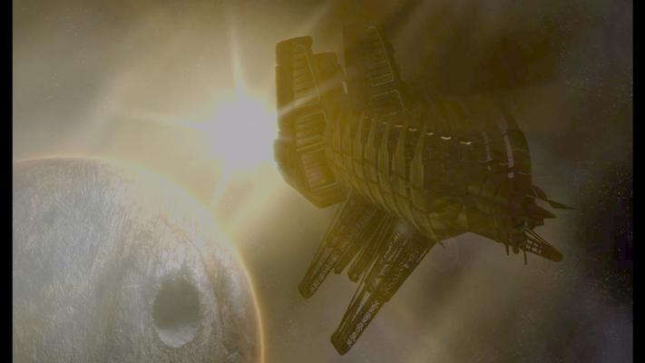
A shot of the Ishimura from one of the game's cutscenes
Given the Ishimura’s immense size (over 1.6km long according to the game’s art) and Space Engineer’s performance issues with large ships, I didn’t really expect a replica of the Ishimura to be usable once created. That said, I still liked the idea of piecing together the various details about the ship we see it throughout the games.
I managed to build out a few notable sections of the ship (screenshots at the end of this post if you’re interested) but the project eventually shifted to just mapping the Ishimura’s interior and exterior without Space Engineers as reconciling the details across each game become a project of its own. Ultimately, I put this effort on hold for a couple years but I wanted to share some of the challenges I faced and where I plan on taking this project in the future.
Fair warning, the rest of this post is going to be me overanalyzing and speculating about inconsequential design details of a fictional space ship from a game released over a decade ago. If that doesn’t exciting, I don’t think the rest of this post will change your mind. With that out of the way, let the rambling commence.
Why do I need to map anything?
I had originally planned on exporting the 3D models directly from the Dead Space games and using those as a reference but discovered nobody had found a way to do so even a decade after the game’s release (and that’s not for a lack of trying). While some of the game’s characters and animations were exported, the level geometry is encoded in a format nobody has been able to decode to this date.
Without the game’s 3D models as a reference, I begrudgingly captured literally thousands of reference screenshots and dozens of hours of video across each of the games and movie (the second movie didn’t happen and if we all believe that hard enough we may yet will it out of existence). You might think I’m exaggerating but I assure you I’m unfortunately not. To date, I have over 1500 screenshots for Dead Space 1 (DS1), nearly 500 for Dead Space 2 (DS2), and a few hundred from Dead Space Extraction (DSE) and Dead Space Downfall (DSD).
With all those references, you might think recreating the Ishimura would be easy but there’s still a fundamental problem with using references from the games. Fact is, the levels of most video games rarely fit together if you try to combine them. For example, it’s not at all uncommon for the insides of buildings to be larger than the exteriors or for doors to be placed in locations where there couldn’t possibly be anything behind them and that’s just within the same game. It’s even rarer for the same locations to be consistent across multiple games.
Just to be clear, in no way do I mean this as a dig at game developers. The reality is most players would never notice these inconsistencies so it’s not a good use of a developer’s time to agonize over details like these. It’s far more important that the game be fun and Dead Space most certainly is. Unfortunately for me, I do need to care about these details to build a complete map and there are a lot that need reconciling.
The challenge
To give an example of the inconsistencies I found in the Ishimura’s design, let’s examine one the Ishimura’s most iconic details: the sets of gigantic ribs surrounding much of the ship. Every depiction of the Ishimura has these ribs but exactly how many does it have? The answer depends on where you look. Just take a look at the following screenshots:
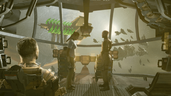
Dead Space 1 - The player's first glimpse of the Ishimura - 8 pairs of ribs
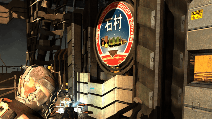
Dead Space 1 - A logo of the Ishimura seen throughout the ship - 9 pairs of ribs
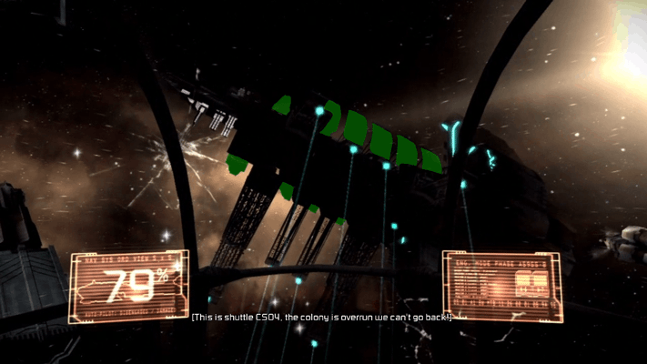
Dead Space Extraction - The exterior of the Ishimura - 7 (or possibly 6) pairs of ribs
These are only a few of the screenshots contributing to this conundrum and only one of many, many inconsistencies to reconcile. Just for fun, here’s a few more in rapid-fire fashion:
- The main tram tunnel in DS1 is wider at the hangar bay than it is at other stations despite the tunnel width being constant in DS2.
- The view from the breached wall of the medical deck is of the Ishimura’s left hull but placement of the deck’s tram station implies the deck is actually on the right and much further back.
- DS1’s hangar bay tram station has a door half-way up the wall of the tram tunnel (near the control room) seemingly for unloading cargo but is several meters away from the tram with no obvious platform to reach it. The game’s kinesis modules could explain the gap but the tram still doesn’t have anywhere to store cargo.
- DSE shows a drain tunnel directly beneath the main tram line but later shows a small cargo gondola that appears to occupy that same space.
- The hull of the Ishimura appears white in DS1 and DSE when performing a space walk but the exterior is depicted as copper or bronze in every other circumstance.
- Shots of the Ishimura’s underside show a single large circular opening which is likely the centrifuge; however, there should also be at least one more square opening for the mining deck.
- Posters in DS1 depict the tram system as being a loop; however, DS2 shows the system is not and DS1’s first chapter also heavily implies it’s not as a single broken car is enough to block the entire line.
- There is no opening in the tram repair bay for the tram hanging in the repair bay to have gotten there.
- Unless the Ishimura is much wider than depicted, the communications array would be sticking noticeably far out the side of the bridge.
- The section of hull beneath the bridge’s ADS cannon should be visible from the bridge’s main deck according to the in-game map but it isn’t.
- The mining deck in DS1 is pointing down at the planet but it should be tangent to the planet given its floor is parallel to the rest of the Ishimura which is definitely tangent to the planet.
- Parts of the in-game map of the refueling bay in DS1 are backwards from the actual layout of the level.
- The Ishimura’s hangar bay is backwards in DS2.
- The games establish that gravity tethers always form a beam from the source to their target but we never see such a beam for the gravity tether that damaged the USG Kellion.
- Dead Space Downfall refers to the main hangar bay as bay 17 while Dead Space Extraction refers to a smaller hangar as 47. If hangar bays are numbered sequentially, the Ishimura would have more hangar bays than it physically has room for even if we assume all of the unseen bays are of the smaller size.
- The main hangar bay in Dead Space Downfall is missing its two elevated walkways, the control tower, and the gravity control station.
- The gravity tunnel carrying rocks through the mining deck doesn’t line up from room-to-room.
It’s not all negative
I wasn’t surprised to see inconsistencies in the games’ level design but I was surprised at just how many design details are consistent across the franchise. For example, the Ishimura’s runway is depicted almost identically between Dead Space 1 and Dead Space Downfall. Similarly, there are several permanently locked doors in Dead Space 1 that we actually get to see behind in Dead Space Extraction.
Even beyond direct design details, the games also give hints at what other aspects of the Ishimura’s design may be used for. For example, the hangar bay in Dead Space 1 features four large doors on the walls of the bay. We see behind one of the doors later in DS1 and learn that it contains a cargo elevator down to the ship’s cargo bay; however, it also contains another identical locked door that we never get to see behind. Late into Dead Space 2, we revisit the Ishimura and upon close inspection we see that we are actually entering the ship through a different pair of those locked doors in the hangar bay. This heavily implies those doors are actually an airlock to the ship’s exterior which would make a great deal of sense seeing as how they also have direct access to the cargo bay making for easy loading/unloading.
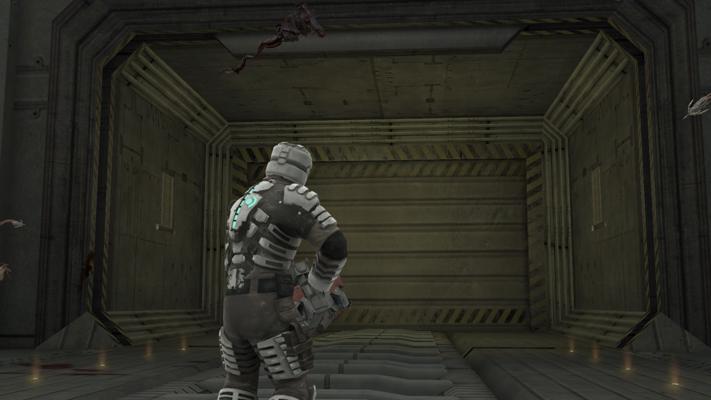
The open cargo door in the hangar bay of Dead Space 1
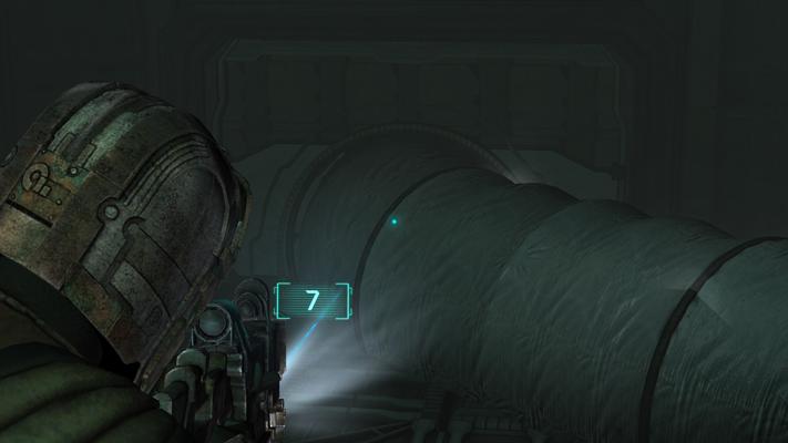
The cargo door Isaac enters the Ishimura through in Dead Space 2
I could go on about other interesting details I noticed when comparing the games but I’ll save that for another time when I have those portions of the ship mapped out.
Where to go from here
Ultimately, my goal is to create a detailed 3D schematic for the entire Ishimura inside and out. In this schematic, I want to incorporate all the locations seen in Dead Space 1, 2, Extraction, and Downfall while also filling in areas of the ship we never see with reasonable speculation. I may decide to include details from the upcoming remake of Dead Space 1 as well but that will depend on how faithful it is to the original.
Thus far, I’ve reconciled some of the ship’s main locations in notes but I haven’t started modelling anything yet. Part of the reason for this is I still don’t have a way of measuring features of the ship. I’ve considered estimating Isaac’s height and using him as a reference but being even a few mm off here and there in a ship this large would quickly accumulate too much error in the design.
Something I’m considering is using a process monitor to find the player’s coordinates in running memory and using them to at least measure the relative sizes of each room. Failing that, I’m also curious if a simultaneous localization and mapping (SLAM) algorithm could be used to build a map of a level based on video input. Regardless of the approach, I have to find some solution to this problem as it’s the main reason I put this project on hold.
I also need to decide what software to create the schematic in. Unsurprisingly, real industrial schematic software is far more complicated than I want to deal with; however, I also don’t want to just create a 3D model of the Ishimura as it would be far too complex to view.
If you have some ideas or want to help out with the project, feel free to reach out via discussions or Twitter.
Space Engineers Replica Screenshots
I want to leave you with a few screenshots taken from my last attempt at replicating the Ishimura in Space Engineers. None of these sections are final as I planned on creating mods to more closely match the Ishimura’s architecture but I still think they look pretty good as-is.
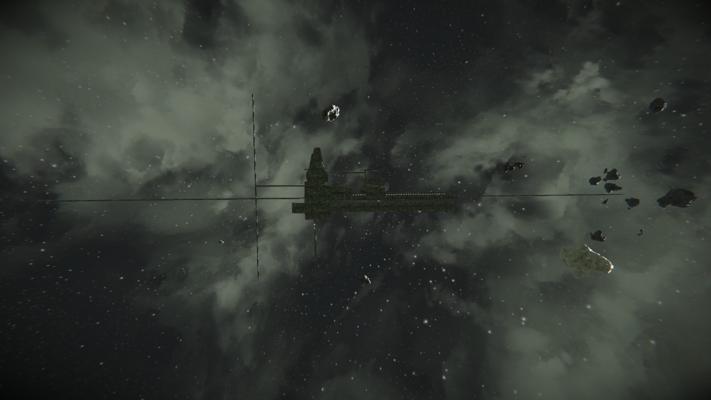
A side view of the replica. The thin scaffolding represents the full size of the ship. To give an idea of scale, the small box just behind the rib is the entire hangar bay from the next screenshot.
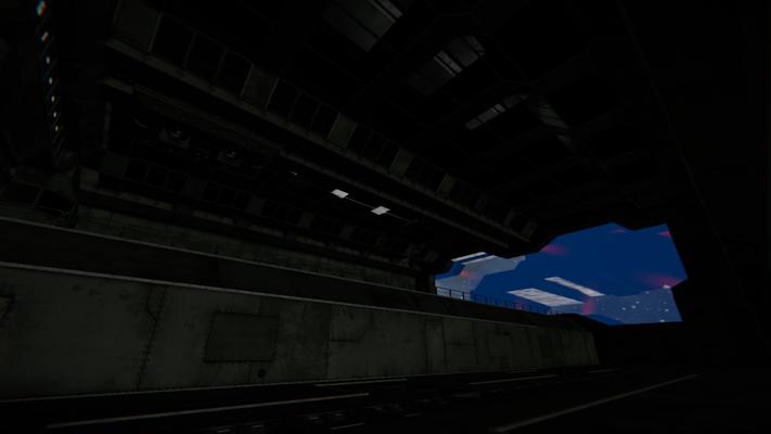
A view from the floor of the hangar bay. There is no working bay door at this point but I did add the forcefield seen near the end of the first game.
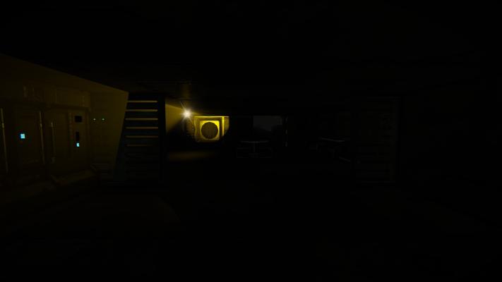
The Ishimura's flight lounge with the quarantine alarm active
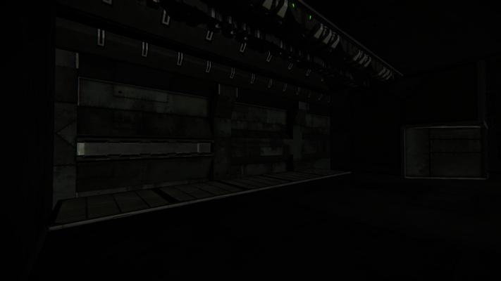
The hangar bay tram station and a view of the tram control room across the tunnel
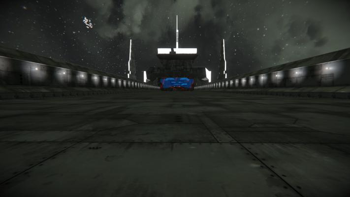
The Ishimura's runway and part of a conning tower as depicted from the intro to Dead Space 1 and the crash scene from Dead Space Extraction